Yondapp
A navigation tool to help you find friends and places where a map may not useful.
Background
Yondapp began as an idea between Marcus, Laura and Chris where, at a festival, they had lost a friend in a crowd of over 100,000 people and with no real means of finding him other than sheer luck. With this frustration at the back of their minds and knowing that their friend missed some special moments, they wanted to explore an app idea which could help people quickly, easily and reliably locate friends and loved ones without the need for a map (in their words: "What use is a map in a muddy field?!").
Our small team were commissioned to help get the idea off of the ground and in to the App Store. We had two clear aims for this project: to generate audience; and provide them with a well defined experience and branded beta product so they could present it to potential investors.
Planning and ideation
To kick off in the right way we wanted to make sure there was an aligned vision of the core product across the team while also proactively preparing testing and research plans so we could iterate quickly after launching.
We left after a two day workshop understanding that the primary focus of the product had to be around 'map-free navigation' with a winning concept – decided by the entire team – explored representing distance and direction via a compass look and feel. As well as this we wanted to explore adding a social layer which segued in to thinking about the ability to add places and friends. There was a feeling that although the core product was a strong idea, introducing social patterns would actually be a key component in giving users a reason to return to the app regularly.
Concepts, user flows and architecture
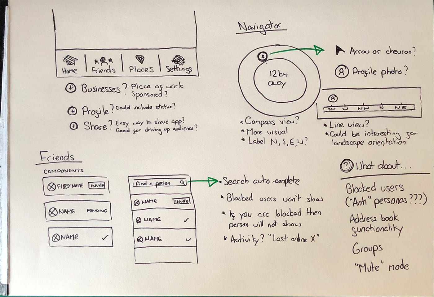
The kickoff session provided me with a bunch of sketches and notes to help get started on concepts. Pro tip: leave initial working sessions with agreed ideas and approach so you can go in to concepts with confidence!
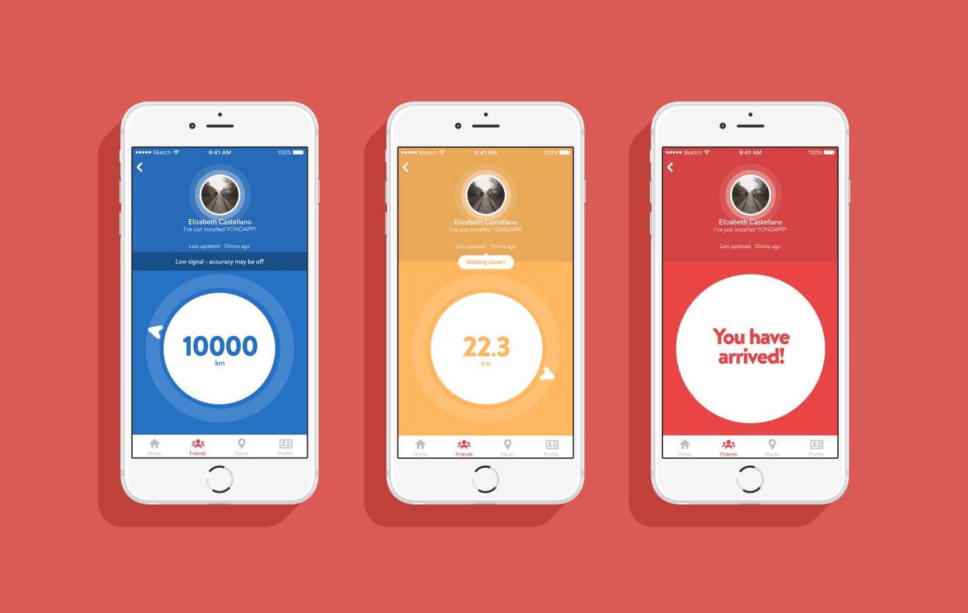
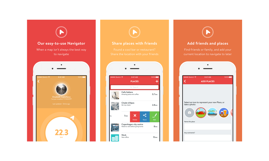
The navigator view
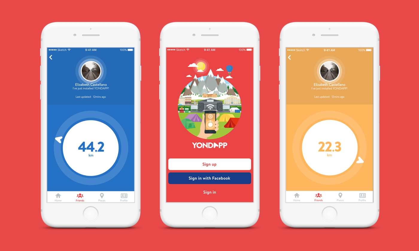
The core idea was explored first – what we liked to call ‘the navigator view’. This was heavily inspired by the simple compass where knowing 2 things: distance and direction can get you to a place or a thing with pin-point accuracy, no topography required. The final UI didn’t actually change too much from these concepts where the arrow would point in the direction of the place or person and the distance would tick down in the middle.

User accounts
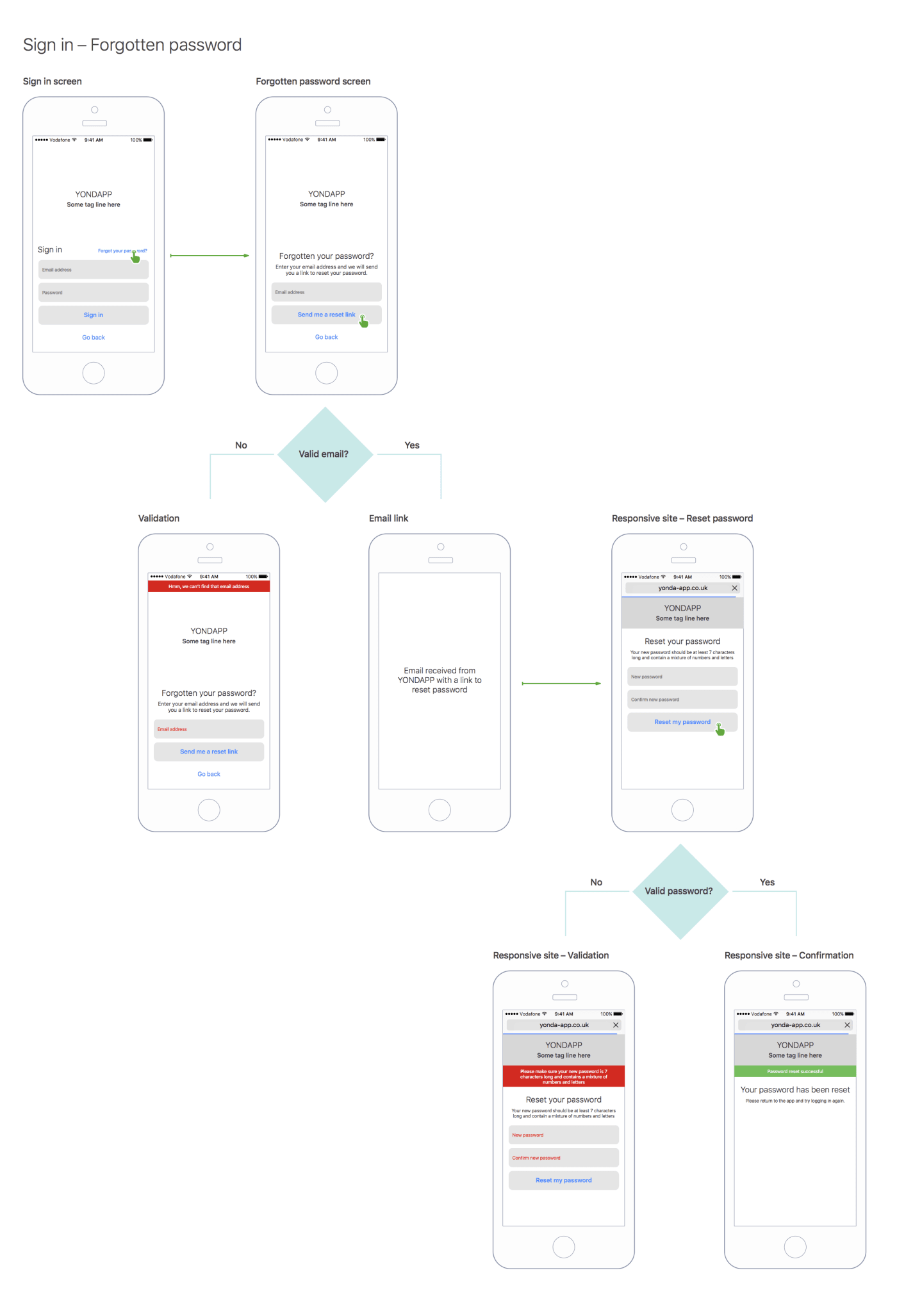
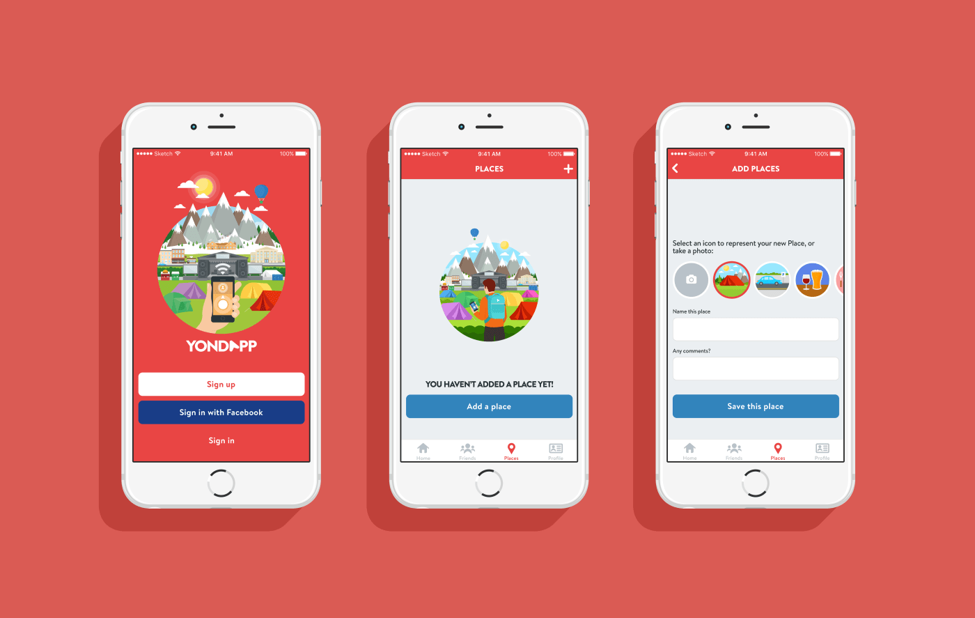
Account creation, login journeys, password reset and editing user profiles came next. Account creation in particular was an important area to start generating an audience – a key goal for this project. To start with we decided to cut out all unnecessary form fields. The intention here was to be transparent of what we were doing with users data and to make signing up as frictionless as possible.
We also added the ability to sign up and login with Facebook too. This began as an experiment to see whether new users would sign up using our services or if they would choose the (arguably simpler) Facebook route. I’ll talk about what we learnt from this a little later.
Let’s talk about social
Captain hindsight here: Designing social features is hard! This area of Yondapp probably had the most focus, energy and testing put in to it.
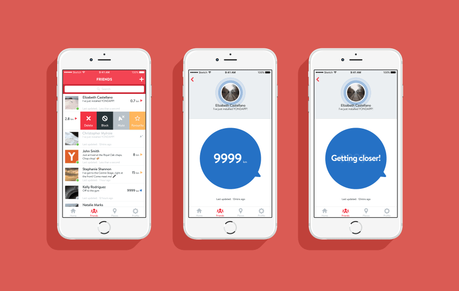
At its core Yondapp relied on live device location so we had to make sure that a user felt confident in its security and safety. If they didn't, they would never use it – simple as that. We focussed on providing a range of tools to give the user as much control as possible. For the beta release you would be able to do the following:
- Set yourself online or offline
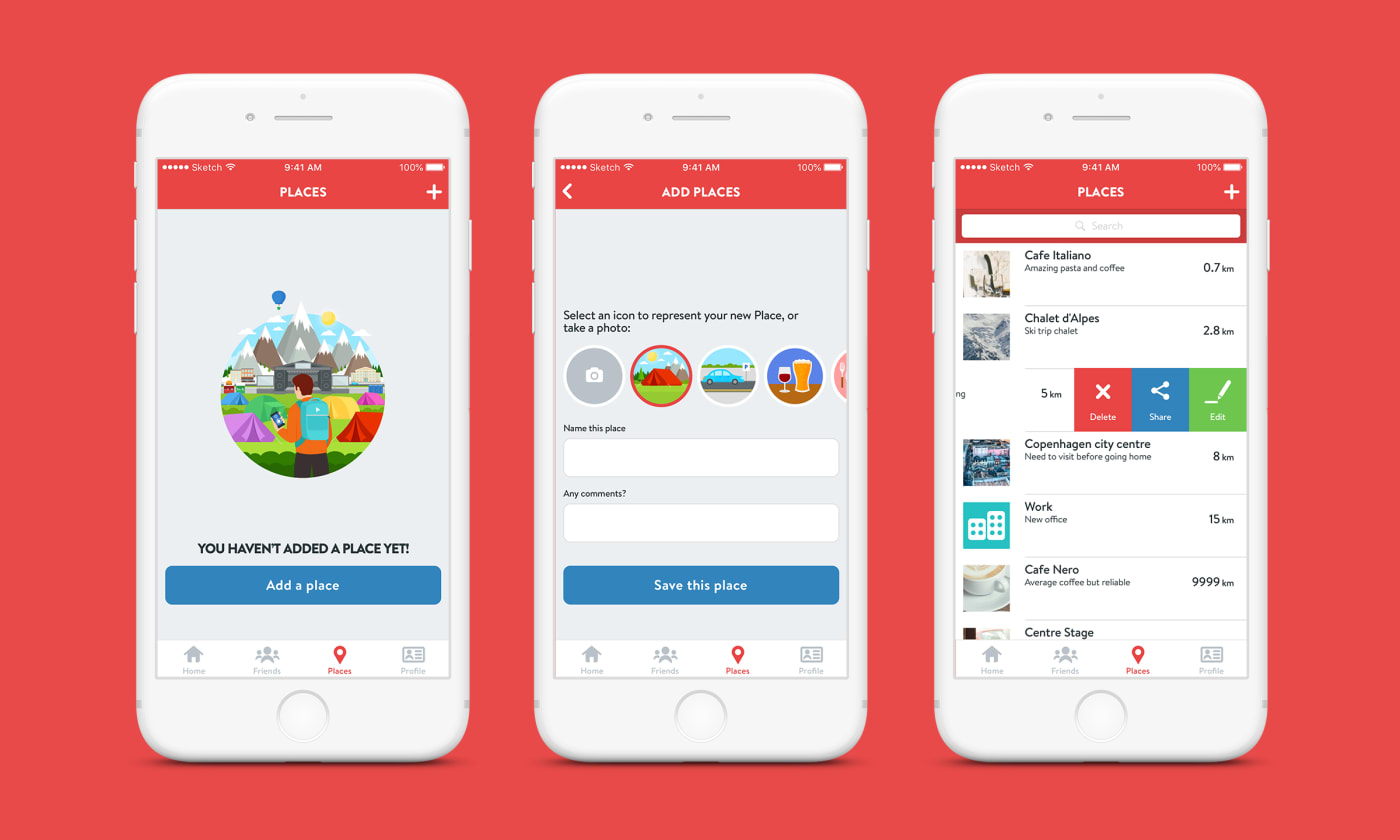
- Add, delete or share a place with other friends
- Add a friend (which would need to be accepted by the recipient before you got access to that users navigator view)
- Delete a friend (which would prevent any future access to your navigator view by the deleted user. You would appear as offline indefinitely or until you added the other person again)
- Block a friend (a blocked user is added to your block list and automatically deleted. You would not appear in the blocked users search results either)
- Mute a friend (temporarily prevent a friend from viewing your navigator until they were unmuted)
Anti-personas
When providing users the ability to add or manage friends, privacy has to be your number 1 priority. In order to help tackle improvements to privacy issues, I made what I liked to call, an anti-persona. Like a persona it represents a typical user type, but of someone you don’t want using your product.
This wasn't a perfect solution in capturing every single edge case, but by getting in to the headspace of a character like Ashley and testing on a Yondapp build ourselves, it really began to help us understand how a user might be able to manipulate certain loopholes in the apps logic. With this additional insight we could therefore react quickly and iteratively to improve user security and privacy while continuing testing. One such idea which was born from this exercise was the feature to mute a friend!
Visual language
Going in to this project I had pretty much carte blanche to make the brand my own – the only ask was that we were all in agreement with the direction. That's music to any designers ears but also daunting at the same time (the fear of a blank page never ceases to take over!). It made sense to set my starting point on the core product idea – the navigator view – as we already had a solid understanding of how it would behave from our initial kickoff, plus I also had a few ideas I wanted to explore.
Designing the UI
There were a lot of wins by starting UI exploration in the navigator view. Colour, typography and core brand elements all stemmed from here. Note to self: always consider starting exploration from the core product idea and then outwards!
I designed a cold to hot colour transition which started off blue and would then gradually get hotter in hue as the user got closer to their destination. Subtle yet effective for gauging distance after a few uses, plus it helped influence brand colour too.
Keeping in mind our initial target audience (festival goers between 18-45) I wanted to make sure the UI was playful yet accessible to a wider audience. After some typographic exploration we agreed that the softer, rounder elements of Brandon Text – but with its strong readability – met the criteria we were after. Graphical elements were also designed to work well with the Brandon font family.
The navigator view was designed under the assumption that the user would be holding their phones in front of them until they reached their intended destination. Typography and UI elements were intentionally kept large and bold so it could be easily readable and scannable while moving.
The rest of the UI fell in to place pretty easily, with iterated improvements after branding and illustration was defined.
Branding
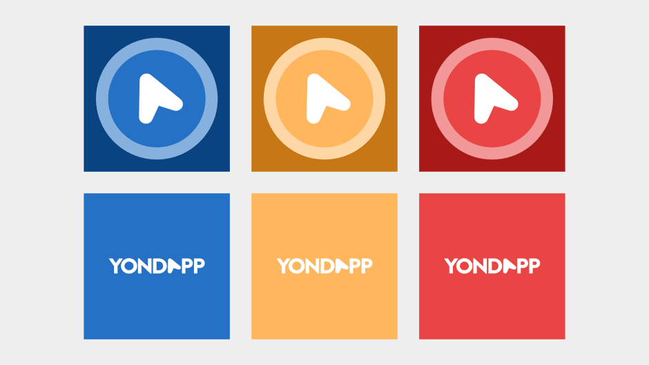
As mentioned previously, core brand elements came to fruition after exploring the navigator view. The navigator pointer graphic turned out to be a real gift, firstly as a subtle replacement for the letter ‘A’ in ‘Yondapp’ and also as a standalone mark. I used this as a starting point often, from branding transitions through to placeholder avatars for new users. It ended up reflecting the core product well and was a lot of fun to put together too!
I’ve mentioned the cold to hot colour transition previously which greatly influenced the brand colour. It’s also worth pointing out that as of 2016 the app store was dominated by blue coloured branding. In order to stand out from the crowd we used our red hue as the primary brand colour. Other brand colours came from key stops in the same cold to hot colour transition.
Illustration
I pulled in an old friend of mine, Dominic Mylroie, to work on illustrations for the project (his stuff is great – check it out!). These gave the brand an injection of character it otherwise wouldn’t have had, and the consistent style feeding in through so many different areas of the app really helped bring it all together. My only regret is not bringing him in earlier during ideation!

Promoting Yondapp
We created a whole suite of promotional material for Yondapp ranging from video intros, physical banners, images for social media, a website, app store assets and a bunch more. It really put the brand to the test. Unfortunately some things didn’t work out entirely as I wanted them to and in hindsight the brand could have been pushed harder and further. I’ll go in to this in a bit more detail later.

Product launch and improvements
The most daunting aspect of the project was actually launching Yondapp on to the App Store. After the initial wave of post-launch euphoria we quickly got to work on building up an audience. We relied heavily on word of mouth for a while but the founders branched out and invested in other avenues of promotion like trade shows and local sports team sponsorships which really helped increase new sign ups, and more importantly we could start collating data to improve the user experience. Here are some improvements we put in to place post-launch:
Confusion at login
Analytics showed a high percentage of users signing up to Yondapp using their Facebook credentials. What was really interesting actually lied in the high percentage of users using the forgotten password journey. More users than had actually signed up through Yondapp! This correlation meant that a significant amount of new users had actually forgotten that they had signed up with Facebook and were being thrown in to a frustrating endless loop of not being able to log in.
Our improvement: To notify users that as we don’t have their details on record they may have signed in using Facebook previously.
User encouragement
A high percentage of users also seemed to drop out of the app while in the navigator view. We originally assumed that users would keep the app open until they reached their destination. We understood that people tend to dip in and out of apps unless they are obliged to keep it open (a sat-nav for example). If there is nothing prompting them to go back to an app users tend to forget they had it open in the first place.
Our improvement: Up until this point we hadn’t considered push notifications. With this issue in mind we introduced periodic notifications letting them know if they were getting closer or further away from their intended destination. We also introduced these messages in to the navigator view UI for consistency.
Post-launch learnings
As mentioned earlier I really wanted the brand to have been pushed a lot further particularly in promotional material. This was mainly due to time management from my side and it was a great reminder of needing to set more time aside for these things and – more importantly – to use the resources and team around me more effectively.
To date the app unfortunately hasn’t received additional funding to progress it further than the beta, however it has given myself and the team some really useful learnings and insight in creating social navigation apps end-to-end.
Although I hope this isn’t the end of the road for Yondapp it is great to see much larger products like Citymapper integrating ideas like the navigator view in to their own – it at least proves to me the value of our core idea and for users having a map-free navigator at their disposal.