Domino's UK Native Apps
iPhone and Android apps for this popular pizza chain with over 100,000 users per day.
Background
I joined Future Platforms to lead end-to-end product design for Dominos UK on both iOS and Android platforms. Over the space of 13 months our product team released over 22 new updates and I personally led the design of 18 new features and improvements.
Data-driven feature improvements
Future Platforms pride themselves on their research led approach to projects. I assisted in planning and implementing an improved approach for defining new app features, primarily through remote testing. Working closely with Marzia and Olivier, we gathered data through a combination of analytics analysis and reviewing app store feedback to identify potential issues and highlight areas for improvement. Once these insights were gathered, we worked with Domino's to design and prototype solutions which were then remotely tested with real users. The following 3 features are examples of implementations using this process.
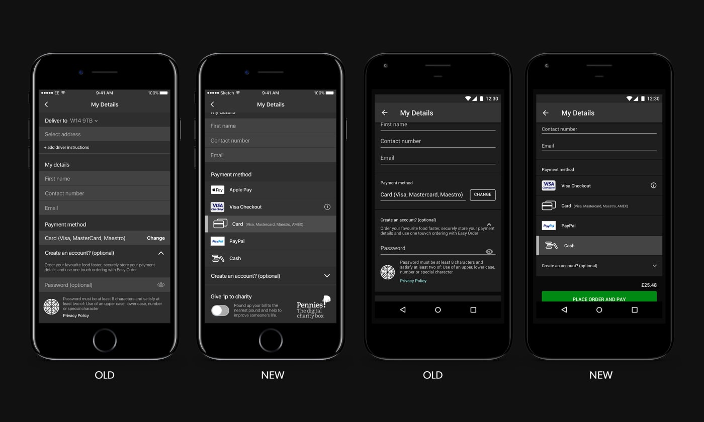
Improving payment selection
If you ask any retailer where customers most likely drop off from their site or app, 99.9% of responses will be at checkout. This was no different with Domino's UK. Through small amounts of user feedback and error response analytics we observed a trend that payment selection and input was a noticable contributing factor to abandonment on both iOS and Android.
Through remote testing we understood that the way users were presented different payment options had simply been missed in its current format. Participants who missed the payment picker proceeded to order assuming they would be taken to a payment screen but in fact were sent to an order error.
We tested two approaches where users were tasked to add one item to their basket and successfully order it: The first approach was simply the current build while the second approach moved away from displaying options in a picker to a glanceable list with actions for more information.
Remote testing notes
Where variation B is the new glanceable list:
- “Just give me the options; don’t make me think!”
- 15/16 participants preferred variation B
- On average, users completed an order 21% quicker using variation B
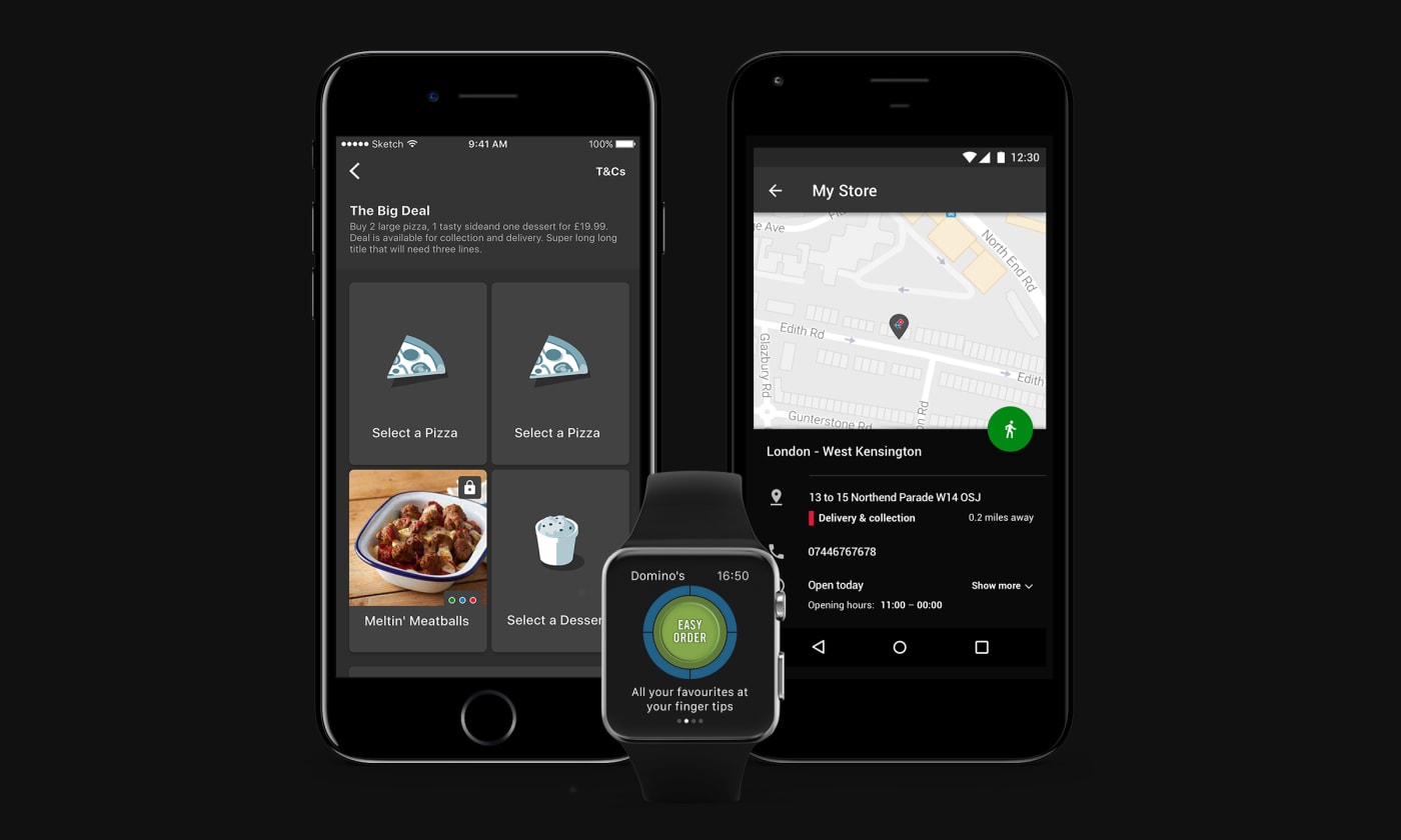
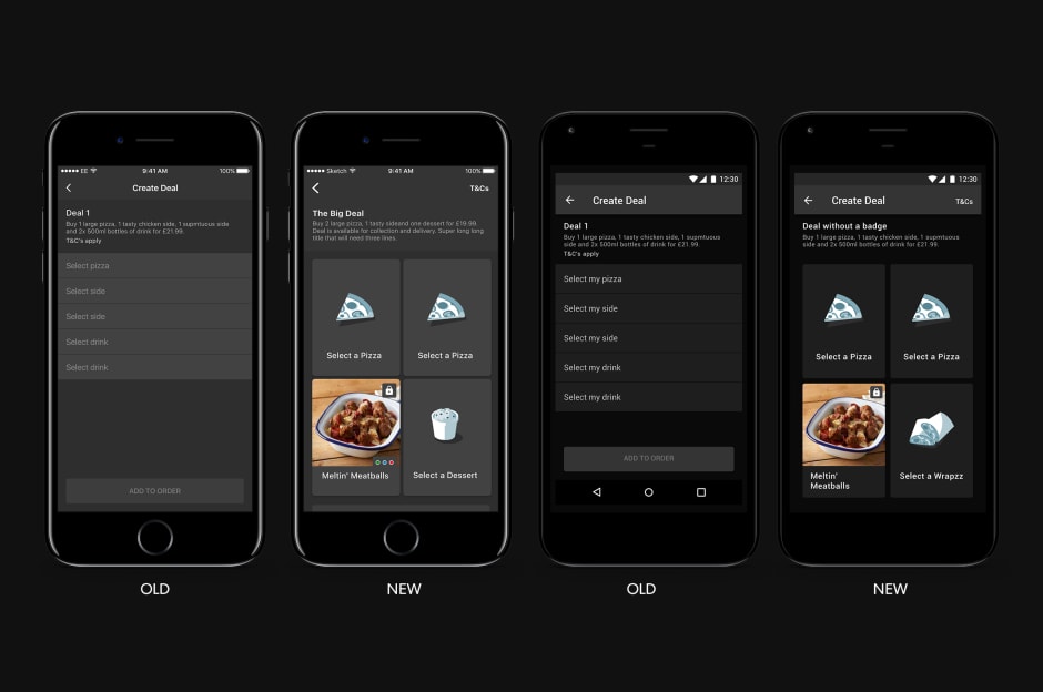
Meal Deal Builder
We updated the look and feel of the Meal Deal Builder to something more visually engaging, with the aim to give the user a clear view of the components of a deal and to entice them to create and order. For the business this was a key feature, used by a high percentage of customers, so we performed a remote test to gauge usability reactions to the new design.

Remote testing notes
Regarding the new Meal Deal Builder:
- "I think that the layout is extremely easy to use compared to really big brands [...] I ll name a few, Domino's for example, I just feel that this compared to that is extremely easy - seeing the pictures really helped [...] I really like the ease for the customer"
- All participants found the new Meal Deal structure clear and intuitive.
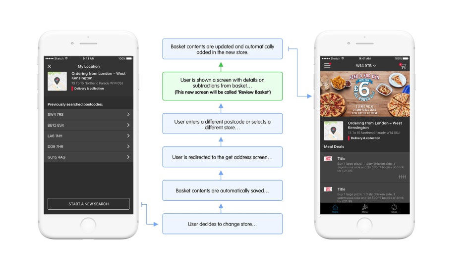
Migrating basket contents (MVP)
Through analytics we discovered that 1.3% of customers decided to switch to a different store while having items in their basket. Logic in the app didn't cater for basket contents to be moved between stores so if a user decided to switch they were alerted that they would lose their basket contents which is a notable pain point.
We knew that this was a piece of functionality which was to be expected by any user and should happen automatically. So we designed an MVP solution where if a user decides to switch to a different store we would automatically migrate the basket over as well, with scenarios to review automatic changes to the basket contents if the new store didn't stock certain products.

Variant testing
More often than not most, if not all, of the above features would also go through a period of variant testing. We used Optimizely to create and manage our variant tests where each test would go through a 2 week period of percentage based increments of 20 until one feature scaled to 100% in which time the test would end and we would remove the losing feature.
Timed Meal Deals
Some Meal Deals were only released to customers within a certain time period. However there was nowhere which stated when the deal would actually finish. 3% of customers fell within a 10 minute window where a deal they purchased was about to expire so were at higher risk of not converting because a deal expired without them knowing.
To help entice customers to purchase quickly 50% of users were shown a timer when they hit the final 10 minutes of a deal, and the remaining 50% were shown no changes. After 6 weeks of running this test it actually proved inconclusive – the 3% of customers who did fall within that 10 minute window didn't make any noticable changes to their purchasing habits and conversion roughly stayed the same.
Business requests
As with most digital products business logic played a big part in the decision making of how the app should work. This was no different for Domino's UK. The following 3 features stemmed initially from business requirements but played a big part in the overall improvement and progress for both platforms.
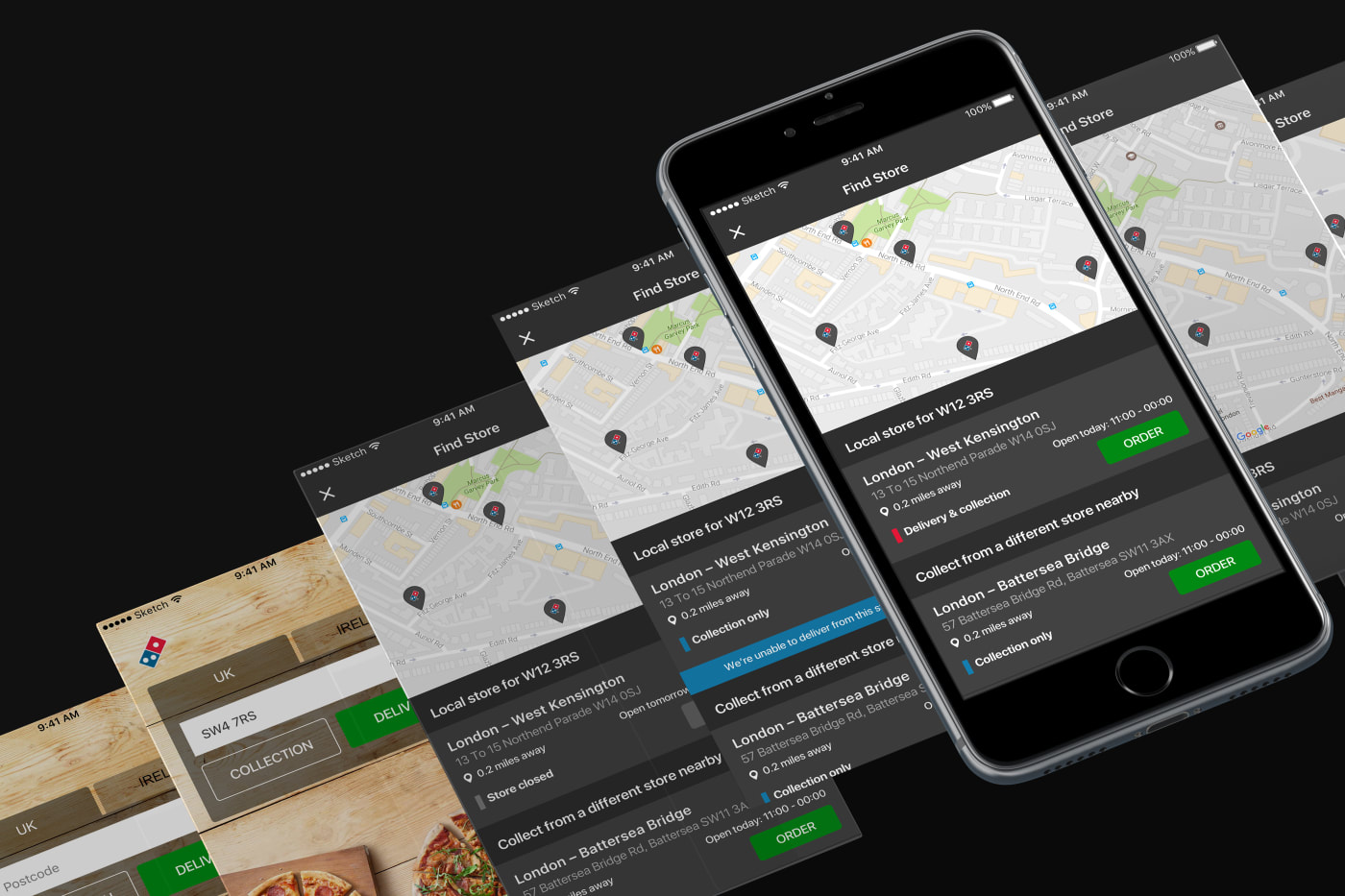
Choose your store
We completely overhauled the store selection process to give users the choice to find a nearby store to collect from. We also took the opportunity to display more detailed information – for example if a store wasn't accepting delivery orders or was about to close – while also displaying todays opening times.
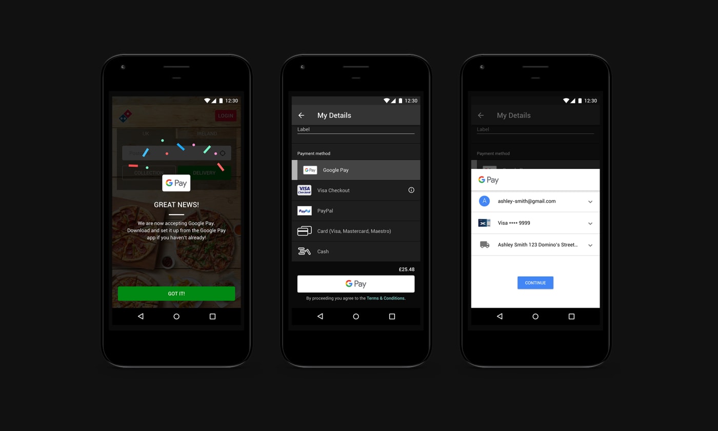
Google Pay integration
With the increased popularity of OS-specific payment providers, we integrated and released Google Pay as an option for Android users, bringing Android in line with iOS which already had Apple Pay integrated.
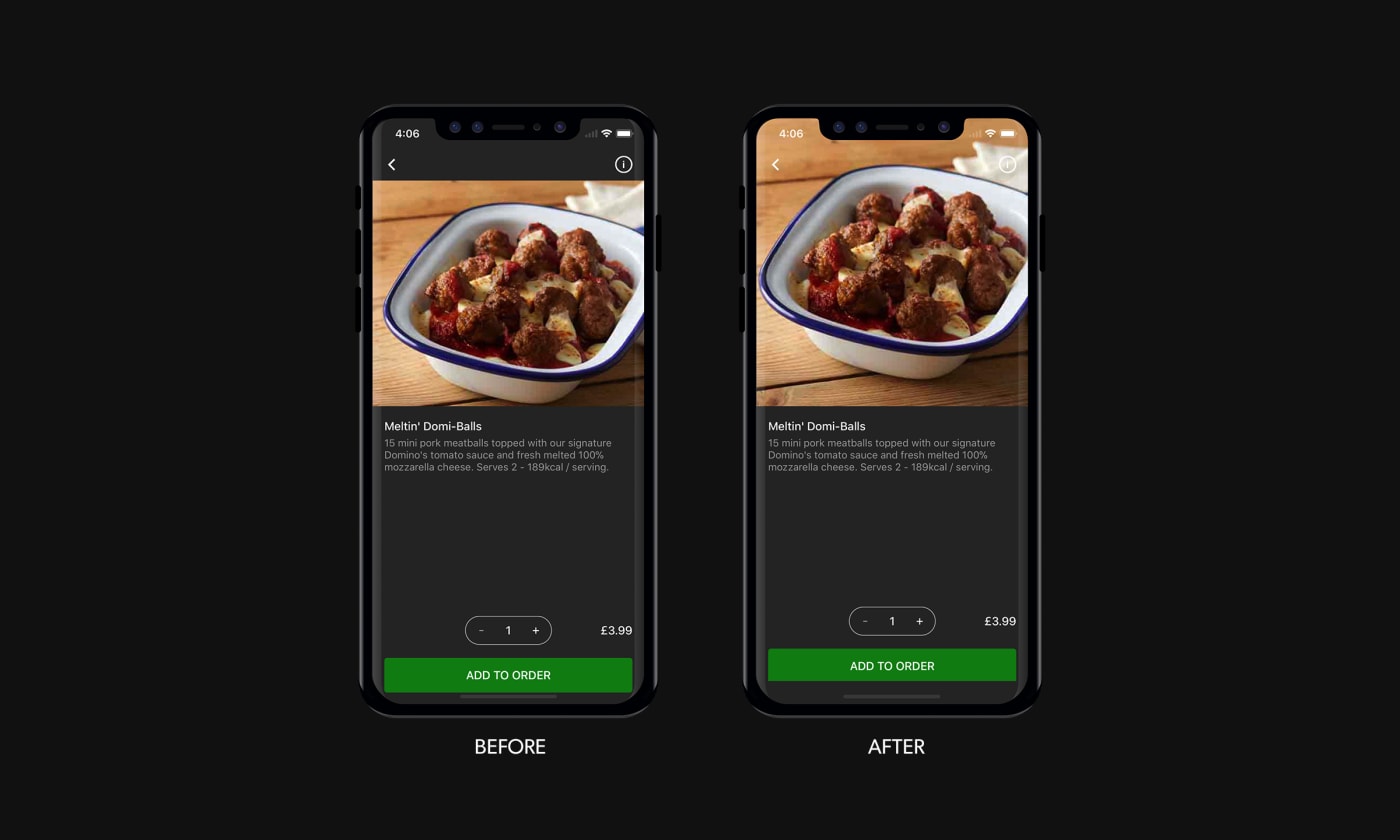
Order confirmation
We redesigned the confirmation screen to display more informative data which the original confirmation screen was lacking and also aimed to make a more visual and interesting scrolling experience through the use of parallax.
Keeping up with the OS
If you want your product to remain relevant and useful for your users there is a big need to keep up-to-date on any current or future hardware and software changes. For a business to sign this off it's tricky because these features can easily be considered sunk costs and the indirect benefits are ultimately something your product owner needs to agree with.
The following iterative updates are examples of updates we provided to support OS updates and improvements.
iPhone X updates
With the announcement of the iPhone X we reviewed the app in-depth to document, fix and release any breaks in layout and general improvements to make it look as best as it can do on these devices.
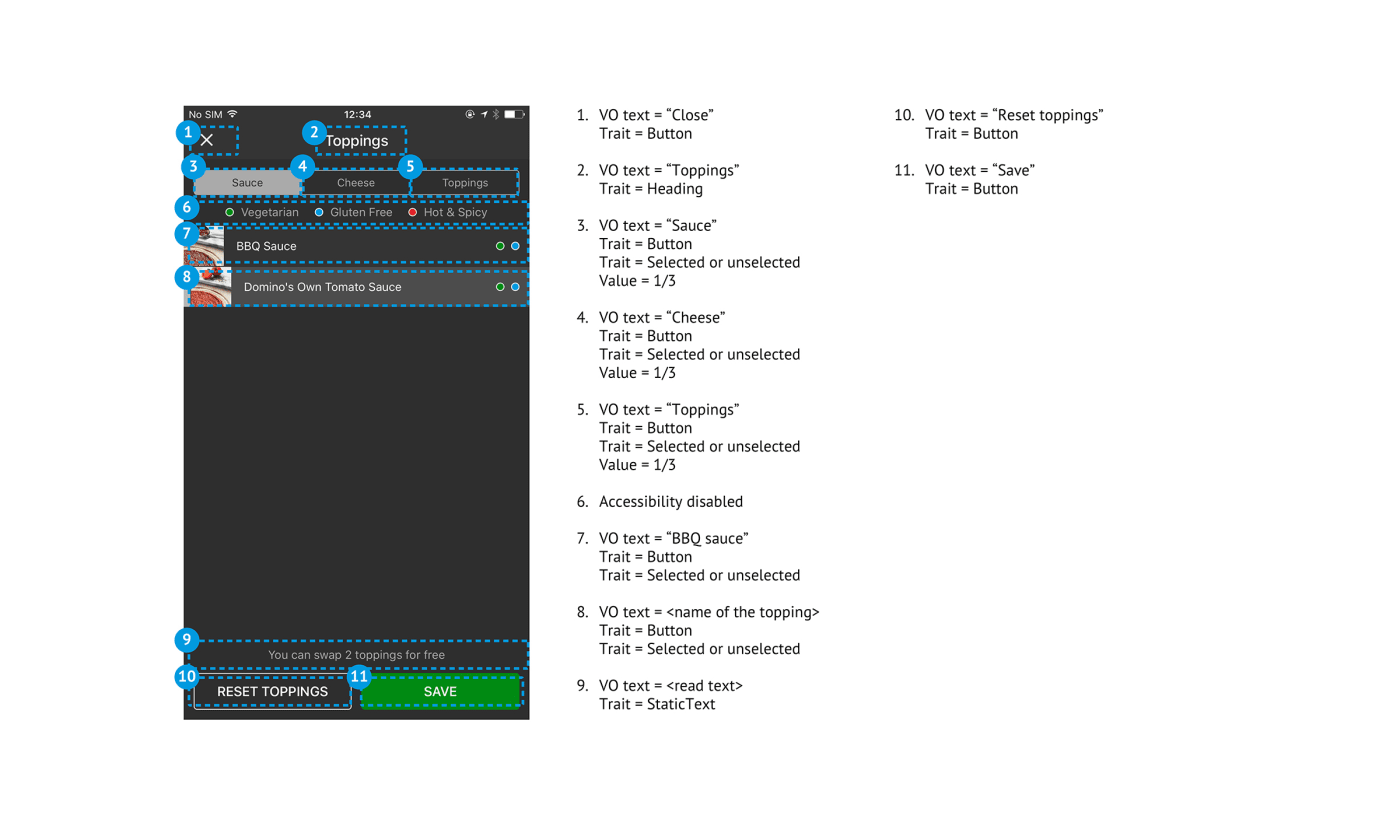
Accessibility
2018 proved to be a big year for accessibility with Apple actively pushing for improvements. If your app didn't cut the mustard then you could be greatly penalised or even denied update releases. An on-going exercise, we continuously kept reviewing the app in-depth to make sure that VoiceOver accessibility was properly catered for throughout the Domino's apps.
Conclusion
Taking charge of a huge clients digital product began as a daunting experience but the process I learned and (I hope) contributed to really taught me a lot about the effectiveness of using data and testing to drive for better features and releases.
As a lot of designers of my generation I come from an obsessive background where the devil is in the detail and if it doesn't look great then you haven't done your job well enough. Thats not to say that isn't relevant anymore but for companies with money-generating digital products they want more evidence as to why we're approaching them to change something. And that's where data and testing really come in to play, not as a replacement for great interface design, but as another valuable tool in your belt.
Average App Store reviews from June 2017 to January 2018:
- iPhone 4.7 / 5 ★ (from 35,652 users)
- Android 4.4 / 5 ★ (from 53,310 users)