Dynamic, JCDecaux
A platform providing easy-to-use tools to deliver contextual advertising.
A small startup which had recently been acquired by JCDecaux, Dynamic focus on delivering a bespoke DOOH platform where clients can easily manage their digital campaigns while providing the ability to easily add 'contextually aware' parameters to their advertisements. I was hired shortly after the acquisition to review, restructure, and redesign their 'SmartContent' beta platform in preparation for launch with key JCDecaux clients.
As our timeframe was crazy short I had to make sure I worked quickly and effectively while collaborating closely with the founders to get agreement and sign-off.
Refining user flows
I began using the beta platform myself in order to review current user flows (as initial research had been lost). Working with Alex (a founding director) we mapped out patterns of key user interactions which helped influence design decisions when we came to paper prototyping.
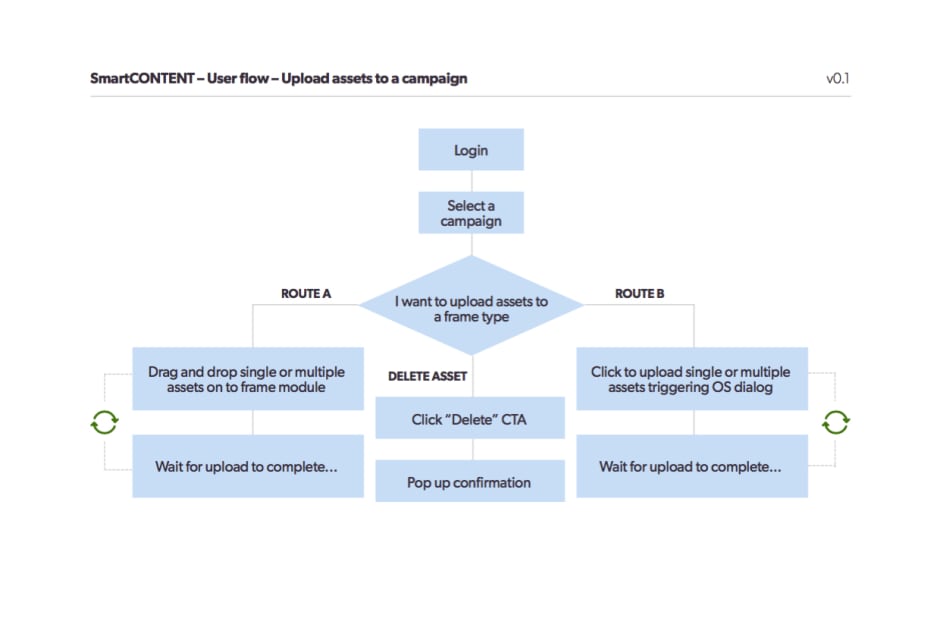
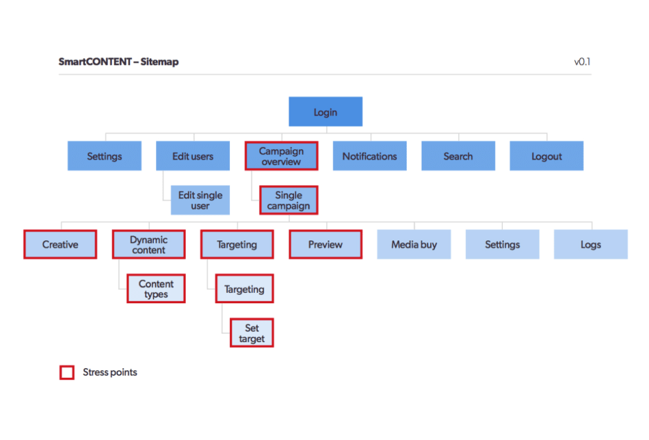
I also reviewed the current site map, highlighting potential stress points which again helped decisions when deciding which bits of the platform we could improve or group together.

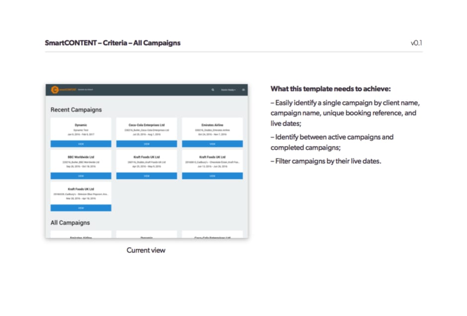
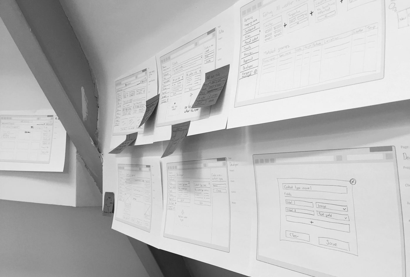
Sketches
Now that I had a much clearer idea of where we should be heading with this redesign, and with a backlog of stories to help guide the design, I worked on initial sketches which helped define top level sections for the platform, and also key interactions we thought may work.
Interactive prototyping
One key area of interaction which I was very keen on exploring was this idea of layering functionality rather than loading new pages. In order to visualise this and get more of a buy in from the founders, I worked up an interactive prototype showing how this proposal would work and how it could be a powerful pattern to be used throughout the platform.
Defining notifications
While exploring the interactive prototype, the founders and I discovered that there was a clear feedback element missing from the current beta and one which we should include for launch.
We basically wanted to make sure that as the user was making decisions with their campaign, the platform was conversing back to them to validate those decisions.
Initially proposed as alerts appearing after certain interactions were made, it evolved in to a message centre on the platform which would also ping emails to the user.
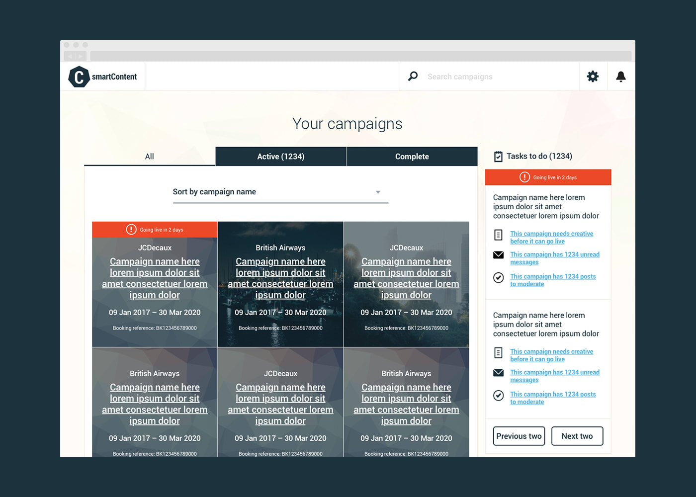
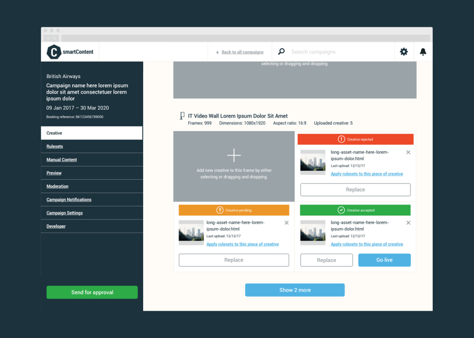
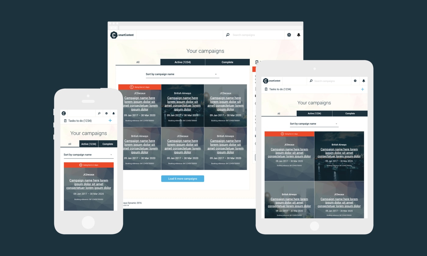
UI components
I initially began by mocking up key areas of the platform and building a component library from there. The UI needed to be relatively simple – almost white-label – as there were plans for clients to be able to skin their own accounts in a future release.
Once I had a library of symbols in place in Sketch it became super easy to create high fidelity mock ups of key user journeys, which would then be handed over to the development team along with a style guide and assets.
Kev came in, got hold of the problem immediately, and delivered us what we needed and more. Loved his work. Will definitely hire him again.
– Alex Matthews, Managing Director