TeeOffTimes
A desktop and mobile platform where customers can book a quick game of golf.
After successfully redesigning their parent site, we were approached by ‘Golfbreaks’ to do the same for another of their products – ‘TeeOffTimes’.
Unlike ‘Golfbreaks’ – which was all about booking a golfing holiday (a slow sale but much higher margins) – ‘TeeOffTimes’ was the other side of the coin. With a quick gains approach, a customer would be able to book a game of golf for within the hour. With this in mind we were able to define key challenges and goals, making sure search was rapid enough, offers were clearly visible, and the payment process was as quick as it could be.
Collaborating with Craig — our UX consultant — we spent a few weeks paper prototyping ideas, outlining key scenarios, and creating in-depth Axure demos for user testing. Alongside this workflow I also got to work creating a component led look and feel for the redesign. Working with our front-end developer, we took an Atomic Design approach making each component separately, and building the pages from there in the browser. This made our design process a lot more fluid where we could prototype more quickly, and visual repetition was kept to a minimum.
Final designs
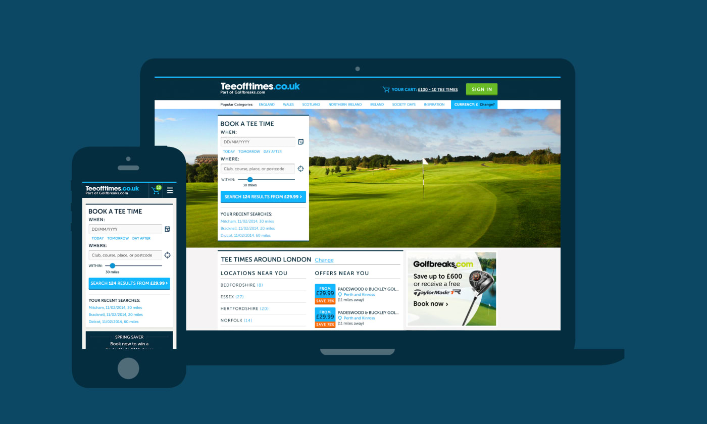
The home screen
The home screen served as a starting point for searching for a course or finding one via your preferred location.
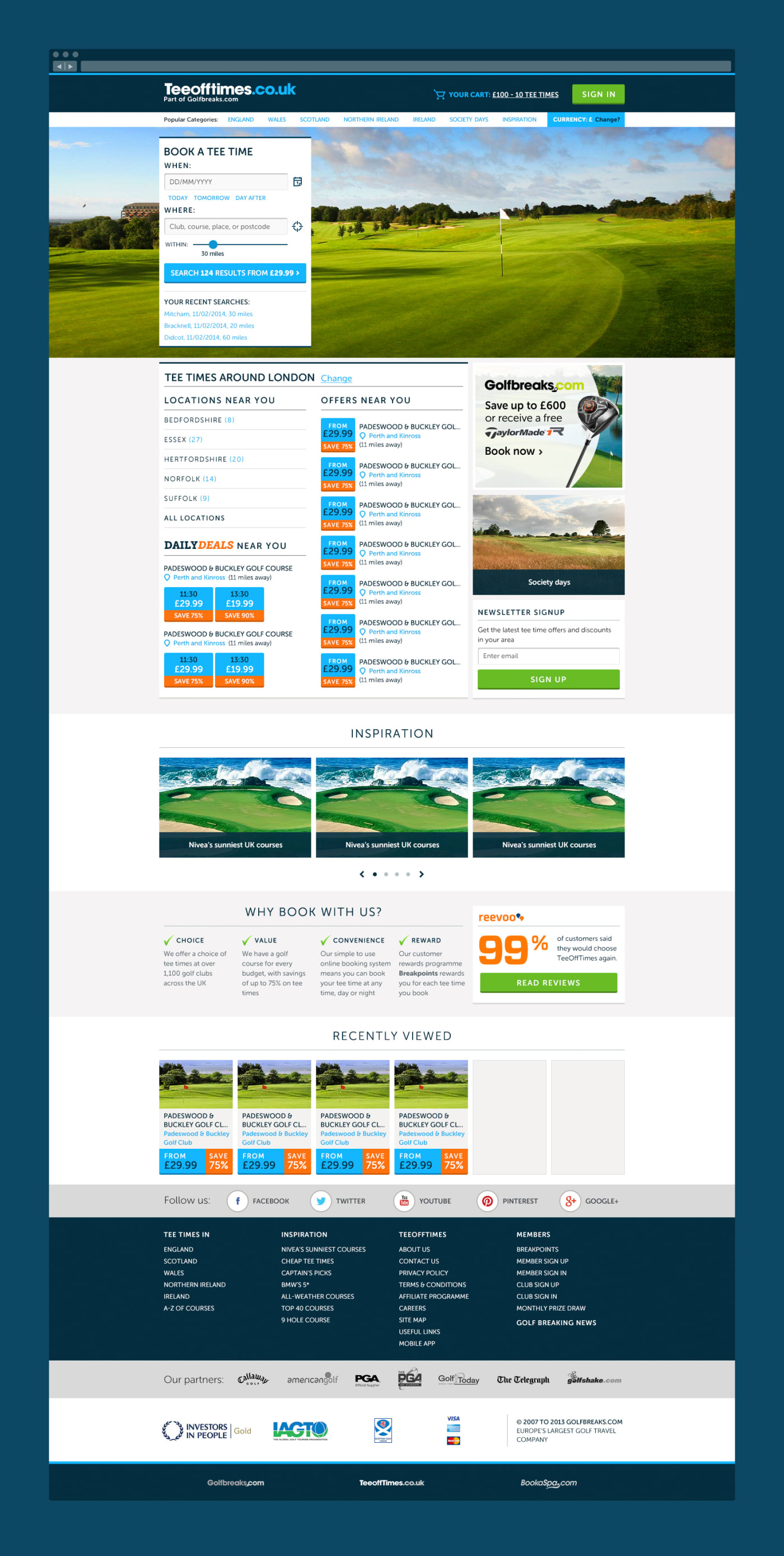
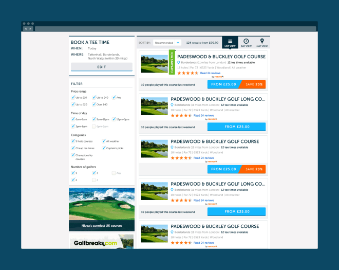
Searching for a course
Users could search for courses and view results in many different ways. One of note was — what we called — the 'Day View' where time was split in to 12 hour increments with prices spanning different hours.


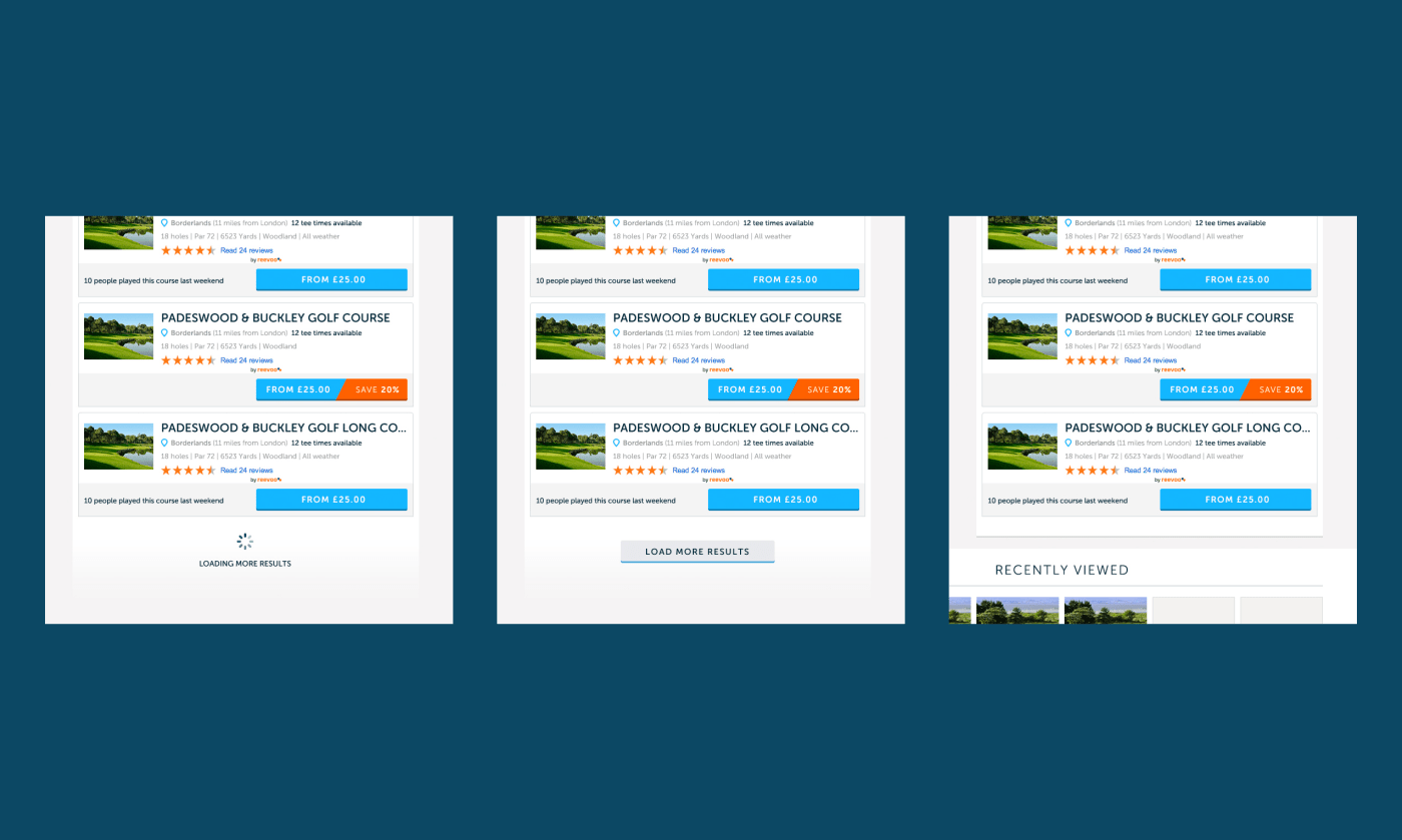
The different loading states for listings. Through research and user testing we settled on auto-loading three times, introduce a call to action afterwards so users could reach the footer, and then a visual style for the end of results.
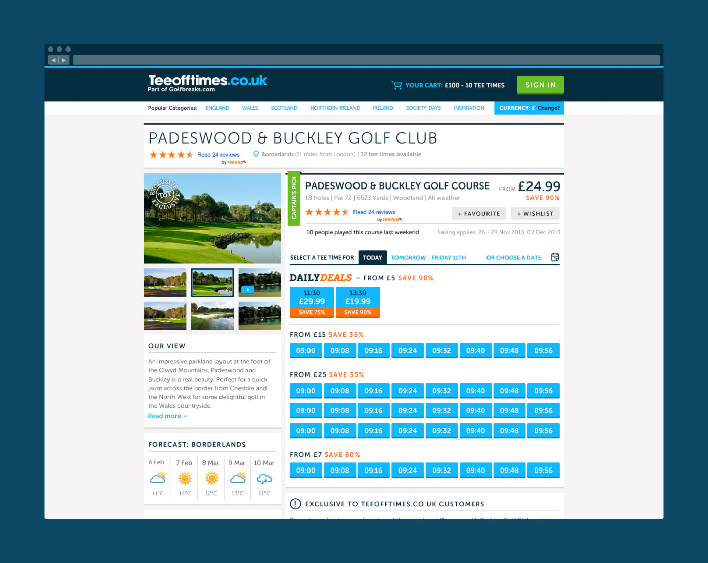
Booking a course
Users could find out more about a course and select suitable timeslots to book.
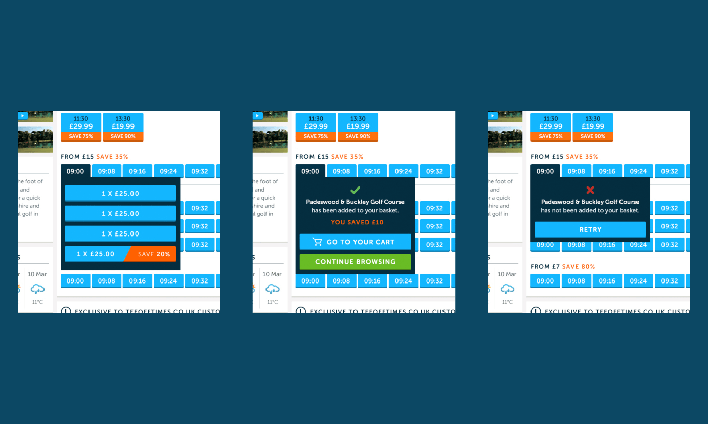
We wanted to keep the journey of booking a timeslot as straightforward and quick as possible. The interaction was kept in one modal to avoid any confusion and create a quicker interaction.
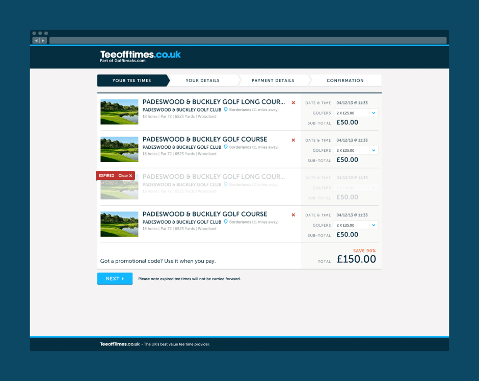
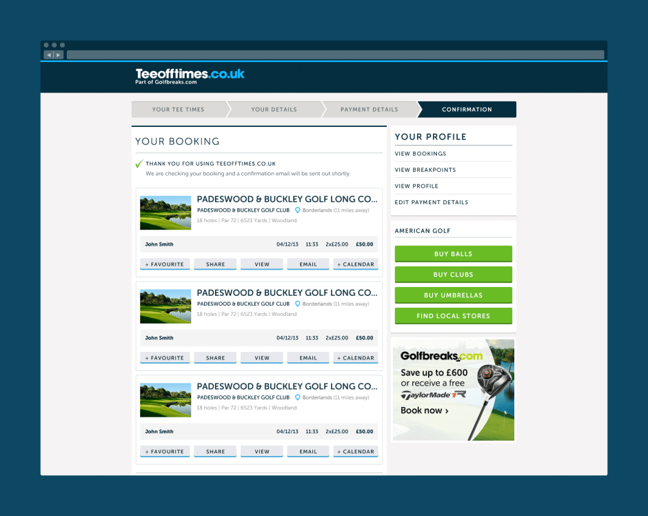
Purchasing
Similarly to booking a timeslot, the purchase funnel was reduced to necessary components. We stripped the navigation back to avoid distraction and provided a visual breadcrumb to split up the purchase form in to simple chunks.