The art of retention
I've been trawling through the archives of Paul Rand and it reminded me of an important lesson I'd forgotten about.
Its 2004 and once a week after sixth form I would journey to Central St Martins in Holborn, London (at their stunning historic campus which has now sadly gone) for a 12 week Graphic Design short course. I remember showing up one day and we were all given an A4 sheet of paper each with a different brand printed on it.
Our brief was to sketch out tiny changes we would make to the brand given to us and discuss with the class why we felt those changes improved the overall identity. I ended up with the brand for Boots (a UK health and beauty retailer with a relatively well known identity) and recall removing the oval shape containing the identity to remove a constraint I felt was not adding much.
This exercise aimed to teach us about small changes making a big difference but also how retaining details can be just as important when working through a brand refresh.
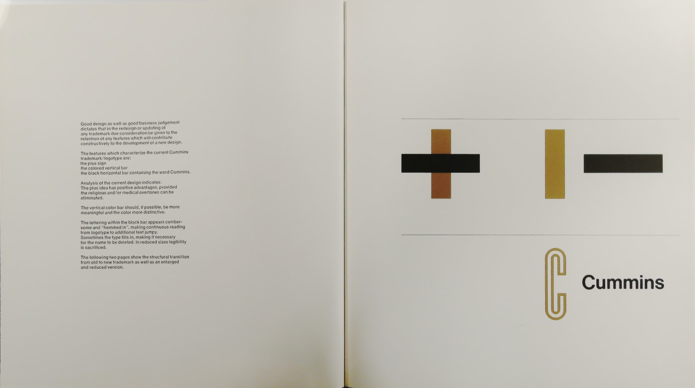
This weekend I've spent some time exploring the archives of Paul Rand. It's a fantastic treasure trove of logos, presentations and concepts which I highly recommend exploring. One particular proposal for the Cummins Engine Company began with this preamble:
"Good design as well as good business judgement dictates that in the redesign or updating of any trademark due consideration be given to the retention of any features which will contribute constructively to the development of a new design"

It's a simple enough statement but it encapsulates what we were trying to be taught in that design exercise all those years ago.
Thinking about the year ahead I've been telling myself to focus on iteration — this has reminded me that what we retain in our designs and experiences is just as important.